
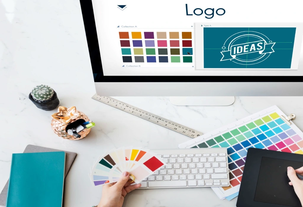
10 Essential Tips for Designing a Professional Logo
Ten practical principles for creating a distinctive, useful, and scalable logo that reflects the identity of a brand.
Introduction
A logo is one of the most visible parts of a brand identity. It should communicate clearly, remain memorable, and work in every context.
- Keep it simple. Remove details that do not improve recognition.
- Start with strategy. Understand the brand, audience, values, and competitors before sketching.
- Make it distinctive. Avoid generic symbols and short-lived visual trends.
- Design in black and white first. A strong idea should work without colour.
- Choose colours deliberately. Use a focused palette that supports the brand personality.
- Select suitable typography. Letterforms must be readable and consistent with the concept.
- Check scalability. Test the logo on a small icon, a business card, and a large sign.
- Protect balance and spacing. Clear proportions make the mark easier to use.
- Test real applications. Preview the logo on screens, print, packaging, and social media.
- Deliver a complete system. Provide useful file formats, colour values, and basic usage guidance.
Final thought
The best logo is not the most complicated one. It is the mark that expresses the right idea with confidence and clarity.